Samstag, 6. August 2011

written paper

At the beginning of the course I was very much into painting

portraits - mostly black and white - of people, that are often overseen,

such as tramps and alcoholics, but in my opinion had very

interesting faces. I encountered them randomly on the streets,

asked to photograph them, then I painted them on a large scale in

the majority of cases - celebrating the uncelebrated.

Within the course I started to question scale, experimented with

different formats, played with colouring, but I kept on working

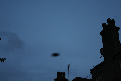
with random encounters - not only in the context of humans, but

also objects and street-scenes (CCTV), and lastly with images

I found on the internet. I began to get more and more interested

in the gap between the actual, visual content of an image, and

the social context that it was being made in. I got very interested

in the manipulative nature of images, and how they change our

perception of facts. I started deliberately misleading the viewer

and tried to misdirect the interpretation of the observer within

a painting. The source of the image and the actual context is

disguised through my selection process, which only shows a

fragment of the whole story. So the viewer starts to build his own

subjective story of the painting, which is dependent on his very

own perception and experience.

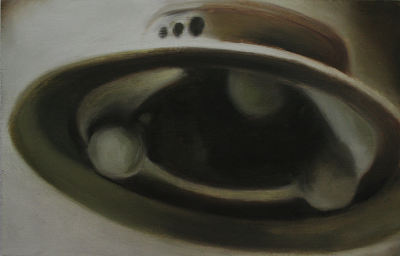
Later on, I started to include the fake subject matter in my work.

I became interested in imagery and myths that arose with the

support and „proof “ of fake imagery. My own experimentation

with faking photographs (without the help of photoshop) helped

me understand how easy it is to form content that misleads the

viewer. The painting of fake images adds another layer of fakeness

to it. Painting is less believable than photos, even in times of photoshop

we tend to believe what we see in photos, as photography

has a much more objective character than painting, where every

stroke is human-made, thereby subjective and not reliable. At the

moment I play with these properties of painting, adding simple

almost naive marks as ufo´s, ghosts etc. . This added humour and a

certain ridiculousness to my work that it did not contain before. I

make fun of the paintings inability to be valid as a proof, but at the

same time questioning the reliability of images in general.

After the course I´m planning to make a series which adapts the

visual language of -missing- posters, and insert my own ridiculous

content, such as a devised animal (lion, octopus, or a mixture of

both...), or maybe even just a simple painting mark, that is being

interpreted by the viewer.

I want to do further work on the hoax-character of my more recent

creations, maybe also with mixing silkscreen and painting.


Freitag, 5. August 2011

oil on wood / 40 x 40 cm


Most ghost photos are based on a snapshot. It´s typical for these images, that the intention was not to photograph a ghost, or paranormal phenomenen, but the family, a group shot, or in this case a child. After the photographic process people find unexplainable things in the completed image.

Many fake ghost & UFO photos play with this typical given fact, and stage-manage a classical photosituation where they involve their -proof- in the backround, often out of focus, to support the mystery within the image.

The photo I painted is one of the first to be found on Google, when -Ghost- is being written in Google. I don´t know if the template I used is a deliberately staged image e.g with a fog machine, or it´s just a random dust-clowd provoked by the neighbour´s mowing machine, but this image is definitely one of the most-present images in the internet when it comes to ghost-imagery.

Montag, 1. August 2011

selfmade fake photos

it is surprisingly easy to fake photos, even without photoshop. I think, they are mostly even more successful if they are done analogue without manipulation afterwards, as people are rather looking for typical photoshop errors, such as wrong light / shadow, selection contour, resolution difference... .
two examples of fake photos of ufo and ghost I made myself with a tealight on a string and smoke machine.


Freitag, 29. Juli 2011

oil on wood / 20 x 25 cm


The very simple shape of the so called orbs is very interesting for me. This eccect mostly appears from reflections, snow, rain or dust. Many images of the orbs are visually very appealing, and often almost seem abstract.

The image I chose interested me because of the simple composition (horizontal line in the backround & dots in the foreground) People who don´t know about the orbs-phenomenon will probably rather see an abstract painting, but as in many other cases in this series, the surrounding paintings form the context and content of this painting.

Sonntag, 24. Juli 2011


oil on wood / 40 x 40 cm

This painting seems to be from a planet, or the moon. Actually it is a close-up of an orb - probably a reflection of something. I chose this image as it is hard to read correctly, even if it is very realistically painted, almost withoout visible brushstroke. The viewer probably tries to find the meaning of this painting in the mystery of the moon. This deliberate isleading of the viewer interests me very much and is contained in many of the paintings in this series.

Mittwoch, 20. Juli 2011

oil on wood / 25 x 20cm

One of the most ridiculous & absurd paintings in the series. It´s not based on a template, completely made up. The actual UFO is made by two simple marks, obviously painted and it´s also obvious, that this image never existed as a photo. As images of UFOs always have a certain will to be authentic, this painting in its obvious, absurd way seems quite funny in a ridiculous way. It´s farcical to forward this image as a proof for anything´s existence, but (I hope) it still questions images and their credibility in general.

Freitag, 15. Juli 2011

oil on board / 40 x 60 cm

This painting is based on a selfmade template I made in my back garden. The actual UFO is a tealight on a string, moved to get a motion blur and unsharpness which is typical for these inages. Tha actual UFO was only ca. 60 cm away from the camera lens, but as it´s backround is the sky, there is no optical relation, so i seems far away and big. Perspective, and optical illusions in context with fore- and backround are often being used to create images, that are not what they seem, and deliberately mislead the viewer.

40 x 25 cm / oil on board

This is one of the classics in the series. The template for this paiting was Adamski´s invention and formed the stereotype of most of the ufo-fakes that came afterwards. It shows an Venusian scout ship. but his descriptions of the technology aboard the space ships suffer from an electromechanical view: plausible in the 1950's industrial hopes but surely not with ours. Adamski described no microchips, no fiber optics. his descriptions of the inside of the spaceships also stay mostly very general.
here is a graphic explanation of space-ship.

Dienstag, 12. Juli 2011


20 x 25 cm / oil on board


In 1934, Marmaduke Wetherell had his son-in-law Robert K. Wilson photograph a toy submarine with a sculpted head in order to pass it off as a picture of -the loch ness monster-. Most people fell for it at the time, and an entire cottage industry of nessie hunters was born. The photo I used as a template is probably the most famous of the loch ness monster.

Samstag, 9. Juli 2011

Baselitz in the White Cube

This exhibition has been one of the best ones, I´ve been to so far. the space of the white cube is ideal for baselitz´s massive paintings. They were quite simple though, but very precise. he repeated the subject of the eagle many times, so this was banging into the head. it reminded me to printing. It´s almost, that he is acting like a human printing machine, doing his motives again and again. The urge to produce stuff is incredible. But It seemed to me, as he would simplify his paintings, in order to produce more of them, and not to lose the equality of them by adding too many details. the stroke on top acted for me like a landscape, grabbing for the eagle to get him back on the ground. the fact, that the image is upside down works in a strange way, as he is depicting an animal, which is quite independent of -up- and -down-. also the fact that the eagle is a important national sign/symbol in germany (and other countries as well).
Here is an image of the german reichstag.

Dienstag, 5. Juli 2011

Mc Collum-Robbins interview

McCollum Robbins Interview

Mick Finch about Gerhard Richter

article here

tutorial donal maloney


NAME OF TUTOR: donal maloney

DATE: 23.6.11

STUDENT TO FILL IN:

1. What points were discussed during the tutorial?


It was refreshing, to talk to someone, that did not see the diversity of painting-style as an error, but as a chance. At first we talked about the big -the fight- painting. Donal mentioned, it looks almost artificially constructed. The smaller painting was quickly decoded from him as the tomato fight painting that it actually is, but he said he could not see that as easily in the big one – which shows me, that it´s more successful in terms of being hardly de-codeable. (which I want it to be).

Donal mentioned some neo-expressive painters, like Julian Schnabel. He recommended to insert all painting styles into one painting, however I did not want it to be a painted-collage. (maybe just because I never saw my work in this direction). When I showed him the self-portrait-with-a-toilet-roll painting I made, he noted, that he already sees this direction in my work.


2. What issues will be thinking further on as a result of this conversation?


I will think about ways to insert diverse painting styles in one painting. I´m thinking of quite photorealistic, but out of focus backgrounds, with expressive marks on it. Maybe it would make sense to start by overprinting photos? Ridiculous “proofs“ of e.g. U.F.O.s would maybe be an option. For example a photorealistic landscape as a background with a childish-doodled ufo in a corner....just thinking.


3. Any other comments


It was nice to meet you at white cube. A damn strong exhibition.


STAFF COMMENTS:

We discussed differences between the two ‘Spanish festival’ paintings and how the scale of the larger painting made reading the interaction between the figures more ambiguous (could have been a battle rather than a celebration). Throughout other paintings such as the ‘bucket hat’ paintings and ‘toilet roll’ painting Max continues this interest in how the translation from photograph to painting shifts the narrative. We talked about ways to further develop this. One way we discussed was to introduce crossovers between the more expressionist works and the more detailed U.F.O./paranormal phenomena paintings. Whilst there were four/five different approaches to painting being explored we talked about particular combinations that could cover many of his separate investigations. The main concern would be how to produce results that reflect his interests and generate others, whilst not weakening each separate inquiry through their combination. We discussed different ways of doing this like drawing into the wet paint with subtle drawings that come from images in other paintings. Rather than on overt and brash clash of styles Max discussed his interest in the centralized image. Further analysis of the role of photography in his work will help to identify and clarify his interest in the translation and manipulation of images.

See D.A. Robbins interview with Allan Mc Collum for a discussion on painting as non-transcendental and the gesture used as an ironic sign of modernist reproduction-http://homepage.mac.com/allanmcnyc/amcpdfs/McCollum-Robbins.pdf

See Andrew Otwells article on Richter’s paintings as simulacra- http://www.heyotwell.com/work/arthistory/Richter.html and Daniel Yacavone’s paper on reflexivity- http://www.forumjournal.org/site/issue/01/daniel-yacavone and Mark Finch’s paper ‘Gerhard Richter: The Polemics of Paint’ -http://www.mickfinch.com/texts/gerhard.html.

Following on from our discussion on humour and irony/wit in painting see the work of Albert Oehen, Peter Davies show in the Approach gallery (online) and Andrew Stahl’s paintings in the 1980/90s.


Mittwoch, 15. Juni 2011

Paul Coldwell crit

Notes:

Paul Coldwell Crit 8 June 2011


Max introduced his work by stating that he was interested in the misleading appearance of images: E.g. Supposed UFOs actually buttons; Protesters appearing funny, yet with a serious function; A tomato fight evoking war/violence.

Paul Coldwell (PC) noted the different approach to painting taken in each piece/series.

It was stated that the photojournalistic quality of the images was apparent.

Max noted that the paintings were connected to the photograph. The images read out of context give an initial response which is at odds with their original purpose. The idea is to confuse the viewer.

PC questioned the rationale behind the scale of the paintings and suggested that the sizes could be reversed: i.e. that the viewer would read the protesters differently if they were small as the content of the image would be less immediately apparent. Similarly, if the UFO pieces were larger, the viewer would look and attempt to find things in the vista.

Concerning the Tomato Fight painting, Max stated that he was interested in the movement from figuration to abstraction. PC stated that the painting evoked the massacre pits in Bosnia and that the reality of the image provided an interesting double edge: innocent, yet interpreted as catastrophic. It was suggested that an exhibition at the Imperial War Museum would be relevant.

PC questioned what effect the artist intended the work to have in the world. Max stated that the aim was to confuse the viewer and that he didn’t want to the work read as social comment.

PC noted that the work was jarring a literal reading and that the problem today was that we are not allowed to interpret. The importance or otherwise of the veracity of the image in the context of digital photo manipulation was mentioned.

The way in which people play to the camera in conflict situations was raised. Theatre of conflict.

A question was raised regarding the importance of the viewer becoming confused. Max stated that the titles of the paintings would provide a clue to their intention.

PC reference Hunt’s painting of a tethered goat and the range of ideas people project onto the work. PC suggested that Max consider how he paints and more consciously make decisions about style. The importance of the surface to painting that referenced photography was stated. B.J. Kelmans (????)

-----

Comments on Comments:

I very much liked the idea of making the UFO painting bigger, that the viewer would have to search for the -wrong- thing in the image. Maybe it would be necessary to set the painting in context with other paintings where strange, unexpected things are happening. So I could shape the expectation of the viewer and use it.

I also very much liked the term -theatre of conflict-. I see some potential in it, as theatre automatically includes fakeness. I´m very interested in the interaction with cameras in times of war and catastrophy, and the fact, that every conflict is dependent on media-attention to be successful. The resulting images are semi-authentic, as the conflict is real, but through the interaction with the cameras a fragment of the conflict turns into a staged scene.


Montag, 6. Juni 2011

Essay / Research Paper Unit One

Str_richter

Tutorial 19.5.11 Klaas Hoek

MA FINE ART: TUTORIAL NOTES FORM


NAME OF STUDENT: max strasser

NAME OF TUTOR: Klaas Hoek

DATE: 19.5.11


STUDENT TO FILL IN:
1.What points were discussed during the tutorial?

At first we talked about the series of people covering their heads in interesting ways. I mentioned, that I like the contrast between the photographic background, and the more painterly faces. Klaas raised the question, if I want to imitate photography, or keep it in a painted manner. I mentioned that I would be interested in painting a nearly abstract image into a rather photographic background. We spoke about the point, when painting is actually representing the medium itself, and when painting is representing the image. We furthermore discussed that there is a photographic out of focus, and another – ore more another way(s) of a painterly out of focus. Klaas noted, that it is always a game of the experience, and the existing knowledge of the viewer. I talked about my interest in creating a image, that is abstract from a closer point of view, but from the distance it is decode-able. Klaas mentioned, that it would also be possible, to paint a very close detail of something, which would on the one hand look like an abstract image, but represent something. He advised me to make close detail-photos of things, as a research in this topic, rather than directly try to paint it, as it is quicker.

Klaas recommended me to look at the work of Wilhelm Sasnal. He also mentioned, that Luc Tuymans has published a book with his templates. It would rather be interesting, what other artists look at, than what they actually make out of it.


2. What issues will be thinking further on as a result of this conversation?

I will think about the contrast between photorealistic backgrounds and painterly foregrounds. I also think about, if I want to imitate photography in the background, or keep it in a painted manner. I would rather think about imitation, to keep the contrast strong. Furthermore I want to start doing photographs of everyday-details to get a sense of abstraction in everyday life.


STAFF COMMENTS:


Max showed well-painted canvases where he is looking for researching relationships between photography and painting. We discussed that this remediation is a common issue in lots of contemporary paintings and I was wondering what it was that interested Max in particular. I pointed at elements that were maybe based on a more personal interest than the general issues. There are numerous possibilities to link painterly and more photographic iconography beyond the example of the usual suspects in the topical discussion around painting. Max can paint very well but is still looking for his own entrance to or signature in painting.

Donnerstag, 2. Juni 2011

the fight

64 x 38 cm / oil on canvas

red is the colour of love - or, in a painting it quickly gets a sense of horror, of blood and violence. we all learned that in our life, in our visual experience, in newspapers, billboards and television, sometimes even in real life. In my painting -the fight- I´m playing with this experience. in the first moment, it seems to be a horrible image, a press photo of war or a natural catastrophe. It functions a bit in a similar way like the series of headdresses. The headdress-paintings (people saving their heads against the stones) are from civil-war, they look - in the first impression- they could also be from a strange form of carnival, or another - rather fun thing.
-The Fight- works the other way round. It is an image of the Tomato Fight Event in Bunol / Spain, taking place every year. Its a fun event, where people throw tomatoes at each other, but the image manipulates rather in the horror-story-way. This I wanted to support with the painting, making it a roughly painted mess of violence. I think, as this image is quite small, I will repeat this one on a much bigger canvas. I think the paint itself can support the manipulation much better on a large format, but still very roughly and painterly painted.

we´ll see.

Mittwoch, 25. Mai 2011

Treacle-Action

Nice collaboration with Lois. I liked the action, and loved the outcome.

Freitag, 20. Mai 2011

Cain Caser


A very interesting Artist, not very well known, I guess. I especially like his work as he is talking about it as portraits. With that in mind, it really is at the gap between abstraction in figuration. It is also interesting, as we as humans are so used to look at faces every day, that nearly every form -even when it is abstract - can be depicted as a face.
For me, it´s a very interesting field, and it makes clear, that figuration and abstraction, are only defineable in a subjective way. It´s dependent of our visual experience, and the hierarchy within that.

Freitag, 13. Mai 2011

6

4rtist.com from klitorik* on Vimeo.

Lecture Heather McReynolds 12.5.2011

Yesterday´s lecture was a good one. Heather McReynolds spoke about her work, and about painting in general.

It showed me, that painting does not have to be under conceptual constraints, but can be intuitive, and out of concious approach. She rather saw the dialogue between the paint, the material, and the painter him/herself. Even if the paintings themselves did not really speak to me, it was nice to see, that someone holding a lecture in College has an approach like that.

Headdress


127 x 127 cm each / oil on canvas


This Series is dealing with the tension between what an image actually shows, and the story behind that image. I´m very interested in this gap. An image always gives only a fragment of a bigger story, therefore it is not very precise in telling, not to say manipulative. In the first view this series shows rather funny images of people covering their head in strange ways. but I think one can feel, that there is something serious going on. The templates for these paintings come from german newspaper and internet press. The backround of the images are held in a photographic out-of-focus style, the protagonists of the images are depicted in a more painterly manner, maybe more subjective. I wanted to leave the objectivity of the photograph to the backround of the painting, and express the human less neutral, more subjective.

The images are from protesters from Egypt / Cairo, saving their heads from the stones that are being thrown.

UFO

Pappschablone/Cardboardstencil / Oil on Wood / 20 x 25 cm


Knopf/Button / Oil on Wood / 20 x 25 cm

Knopf 2/Button 2 / Oil on Wood / 20 x 25 cm


The Appearence of images really interests me. They tell lies, manipulate, but still form the way how we see the world. They are mighty, and sometimes they are misused as a proof.


Basis of these paintings were Ufo images from the 50´s, and 60´s. where there was a big ufo hype, and everyone has seen Ufo´s everywhere.


I think I will continue this series with self-made photographs, where I fake Ufo images myself with very simple objects like ventile caps, tea lights, etc.


Appearence dictates the being.


Donnerstag, 28. April 2011

Tutorial / Naomi Pearce 10.3 11


NAME OF STUDENT: max strasser


NAME OF TUTOR: naomi pearce


DATE: 10.3.11


STUDENT TO FILL IN:


What points were discussed during the tutorial?


First we talked about the diversity of my work, and that a fix red thread is not yet visible. we talked about the newest work (guy with pot on his head) and naomi questioned if the scale should be smaller, more intimate. Naomi mentioned, that I seem to construct images that are outside world. I mentioned my interest in the -fake-, (such as my fake CCTV pictures, or UFO pictures), and in the appearence. also the new painting from the guy with the pot on his head appears to have another context (it actually is an image of one of the protesters in Egypt, that protects his head from the thrown stones. Naomi suggested me to spend a day searching for things that are fake, or seem to be something what they are NOT.


What issues will be thinking further on as a result of this conversation?


I will think further about the discrepancy between appearance and being within my paintings. I´m interested in images, that seem to be something, but are something else. Not in terms of formal abstraction, but in terms of meaning. I will also think about, how the title, and also the painting characteristics influences the meaning.


STAFF COMMENTS:


We began by discussing the position of your practice in relation to other more established painters such as Gerhard Richter. In terms of your interest in depicting moments of uncertainty or creating a sense of unease within the viewer we both agreed that Michael Borreman successfully achieves this. This led us to discuss in more detail the importance of scale and the possibility of building up a narrative with multiple canvases which relate in some way to one another.


I suggested looking at artists who work across a diverse range of media but still explore similar conceptual themes, these included Jamie Shovlin who repeatedly explores ‘the fake’ in his practice. Other artists that may be of interest include Gregory Crewdson and Robert Gober for their presentation of familiar and domestic scenes/objects in a disconcerting and uncanny manner.

Freitag, 8. April 2011


I´m happy to have seen the exhibition of Gabriel Orozco in the tate modern. It was interesting to see, how the theme -symmetry- continuously repeats in his work in so many applications. I also liked the simplicity of his ideas, and also the accomplishment. His skill to reinterpret games, locations, objects is stunning. I would love to bring the continouity and at the same time simplicity of art projects into my own work, and it is out of that competition of bigger-more complex-more colourful-more freaky.

His work is an detailed looking at the little, special particularity of everyday life.

Sonntag, 3. April 2011

Tutorial / Jessica 23.3.11


NAME OF STUDENT:max strasser


NAME OF TUTOR: jessica voorsanger


DATE: 23.3.11

STUDENT TO FILL IN:

1. What points were discussed during the tutorial?


Jessica was -another time- surprised by the new direction, my painting is taking. I was telling her, that I´m getting interested in the appearance of paintings, and what´s on the other side actually really the story behind them. She liked the fact that this is a more general area, as I have difficulties sticking to a too constricted theme and working within too much structure. Working with this kind of ambiguity would offer me a wide area of possibilities. I told her about my idea, to rather work in projects, than with a -life theme-, and she said, this is probably the try to escape from a theme, a excuse (I hope, I understood that right). I also told her about a photo project I saw in german media, where landscapes are being photographed, where there are quite hidden -atomic power plants-, and I liked the tension between the apparent idyll, and the small disquieter that destroys it. She then mentioned a postcard with firemen looking at something beautiful in the foreground, whilst in the backround there appears a fire, which they don´t see.

Then I talked about my visit at the susan hiller show in tate britain, especially the -punching judy- room, where this children-story (which I didn´t know before) becomes a kind of horror at the end, which I quite liked.


What issues will be thinking further on as a result of this conversation?


There are different themes, that seem to appear in my work. The fake, appearance, and disquiet idyll. Danny treacy with who I had a guest tutorial, said, that there seems to be something uncanny about the bear-brush, and the puppet head. I very much liked that. I see connection to my destroyed self portrait, which was also an act of destroying the idyll (maybe(coward)). The newer work also appears much more peaceful, than it actually is (hopefully).

On the other hand, I could very much imagine, to paint someone with a tomato smashed in his face, that -on the painting- looks like blood. -same game other way round, but I seem to like to implant a story in the head of the viewer, that is not the right one behind the image. But the viewer decodes the appearance, not the actual “true” content.


3. Any other comments

---


STAFF COMMENTS:

Max has consistently been making interesting work but the development of his themes/direction has had randomness to it until recently. One very important method of making work and allowing it to develop is to understand your own working processes. Max is someone who quickly loses interest in self-confining thematic restraints and so, this slightly more ambiguous approach developing the direction and content in the work I think had been a successful development for him. As long as he remains reflective and questions the outcomes within the work he is creating the work can continue to flourish.


I think he also needs to address the materiality within the work. He jumps around painting styles, relatively randomly, but to what purpose? Can this be part of the work, or at least it should be a considered aspect of it.


This is the photo that I mentioned about the firemen:


McLean, Virginia, 1978 by Joel Sternfeld


Sonntag, 27. März 2011

Susan Hiller Exhibition / Tate Britain


The Susan Hiller exhibition was a brilliant one. She just brings order to things, and makes a brillian piece of art out of it. Her Approach is quite simple in most of her work - collecting and ordering and finding interesting criteria in classifying things.

But also the piece..... was a good one for me to look at. The child-story of punching judy turns out to be some kind of horror- or war-scenario, using two projectors projecting on the opposite side of one room. some sequences repeat many times, and slow-motion and out-of-focus-scenes make it authentic. Furthermore an annoying voice repeats stuff like: "This is how to do it" many times.

It was interesting to see, how she turns stuff into horror.


She also had a diverse range of works shown in the tate britain. she works in projects in different approaches. The concept for most of the projects is very simple, which leads me to a lovely conclusion:


The content of every day contains potential for a good piece of art.

Samstag, 26. März 2011

tutorial / danny treacy

MA FINE ART: TUTORIAL NOTES FORM


NAME OF TUTOR: danny treacy

DATE: 24.2.11


STUDENT TO FILL IN:
1.What points were discussed during the tutorial?

At first we talked about my difficulties with research and conceptualism. If the work follows the written word, or the written word follows the work, and which role plays the instinct in art, and if research can kill it. I mentioned my problems with the question \"why\" and we discussed the validity of that question. In context with my handbrushpainting, and even more with the puppet head we discussed the role of the \"canny\" and the \"uncanny\" in my pictures. Danny was also interested in the context to my family. on base of the dolls head, we came to my interest for clowns, when I mentioned, that I think that the image of every cute thing also contains it´s opposite, the \"uncanny\" side. Canny told me about the origin of the clowns face, which is a rather horrible story.
Furthermore we talked about my cctv paintings, and Danny adviced me to think about the unity of the series, and to choose places where no cctv is expected.


2. What issues will be thinking further on as a result of this conversation?

I found the advice of Danny concerning the CCTV pictures very useful, so I´m thinking more about the context between each piece, and choosing places. He also said, that he believes, that going on working is the best research one can do, so I will try to find my way through working. I´m also thinking about involving more objects or photos related to my family in my work.


STAFF COMMENTS:


As you have mentioned above I found a strong sense of the ‘Uncanny’ in your work. There is something animated within your imagery of very dead things (the brush, the dolls head, the cctv footage). I think you are using the paint in a very interesting way to achieve this. I think you are right to be thinking about the concept/context which can unite your imagery. I would advise you to look at the work and writings of Mike Kelly, particularly on the uncanny and his collection of objects. I really think your strength is in presenting to the viewer a world that is both innocent, almost childish or naïve, yet there is a strong underlying sense of something not quite right, very good.

Sonntag, 20. März 2011

frank auerbach


it´s a shame that I didn´t came across this painter earlier. one of the most intensive and paste-like painting styles I know. but there also seems to be (maybe it´s just me) that sense of unsharpness like in photos in parts of that painting, where the figure and backround meet.

Donnerstag, 17. März 2011

Graham Rawle


A very interesting lecture. The content of it was not really relevant to me, but just the way he enjoyed doing his art, and transferred this onto the artwork. Graham seemed very idealistic, in terms of who he is working for and for which project.
I also found the simplicity of his work quite stunning. A simple Idea, but consequent working on it.
He really seemed to be united with his artwork. Very inspiring for me, as I´m still searching for the "ME" in art.